BD brand refresh
Company
Becton Dickinson
Year
2015
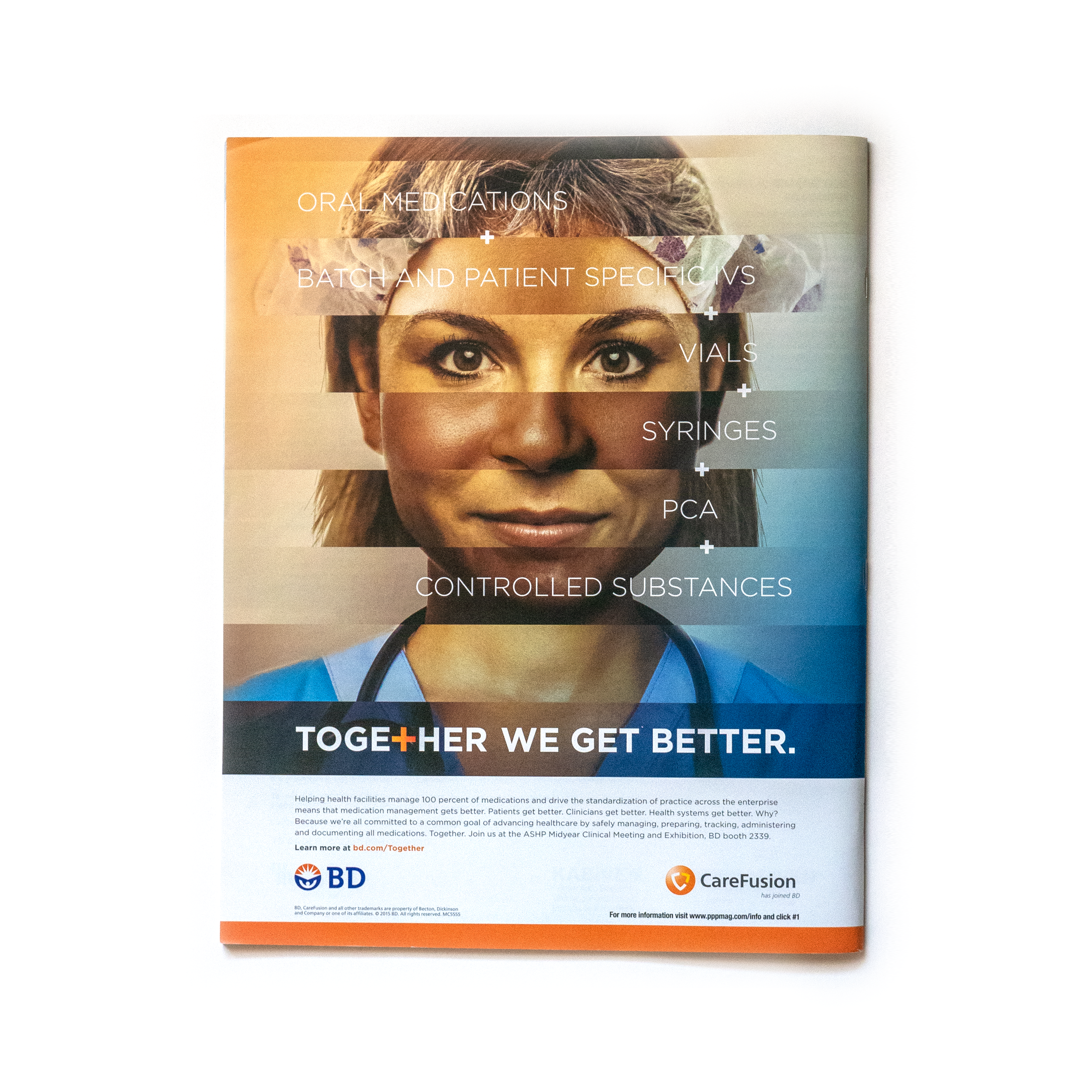
Before the brand refresh, we ran the Together We Get Better campaign to drive awareness of the merger and ultimately that CareFusion has joined BD. During the integration of CareFusion and Becton Dickinson (BD), we worked closely with Lippincott in New York City to refresh the BD logo and overall brand.
At its heart, the BD symbol is an emblem of promise, hope, and optimism for advancing the world of health.
A human figure reaches upward and outward, embracing the rays of sunlight, an expansive embrace of the opportunity to make a difference. The logotype was light, rounded, nimble, and approachable. The blue and orange colors were fresh and vibrant.
These elements conveyed our humanity, leadership, collaboration, and agility.
Our brand personality
Human. Dependable. Leading. Innovative. Agile. Global citizen. Smart. Collaborative. Trusted.


